
As news of the rising death toll from the California fires continues, NOAA satellites help capture the extent of the devastation. NOAA GOES-16 and NOAA/NASA Suomi NPP use their unique vantage to monitor the extent, location and temperature of fire and smoke. The satellites are also able to map the burns scars from the fires.
A Quick and Deadly Fire
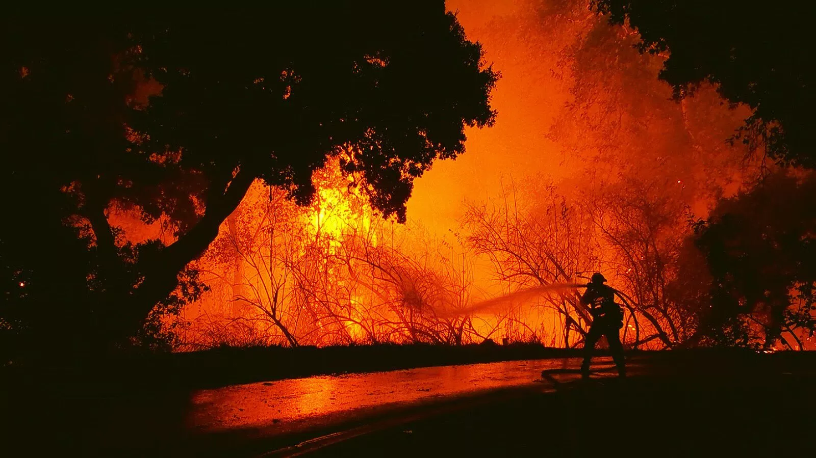
October 9th-13th was the deadliest week in California wildfire history, as reported by the American Red Cross and a number of news outlets.
The fires erupted and spread quickly on Sunday October 8th 2017. The famous winemaking regions of Napa and Sonoma were hit especially hard. Part of the fast paced nature of the fire growth was due to the high speed winds in the area. California state officials have not yet determined the original cause of the fire, but the strong northeast autumnal ‘Diablo winds’, the pronounced growth of vegetation resulting from last winter’s wet conditions, and the typical dryness of the region’s warm season, which was much warmer and slightly drier than normal, made the area prone to these dangerous fires.

According to Climate.gov the extremely dangerous fire conditions actually began last winter, with near-record precipitation between December 2016-February 2017. The drought-busting amounts of precipitation re-stocked the state’s snowpack, which had been heavily depleted by 6 years of drought.
The wet winter fostered “megablooms” of desert wildflowers and ushered in a lush growing season. Unfortunately, the climate swung to a different extreme. The state’s second-wettest winter on record was followed by its hottest summer. Baked to tinder in the extreme heat, the abundant vegetation of spring became the kindling for these autumn fires.
Researchers think that California and the rest of the U.S. Southwest are likely to face this kind of devastating fire season even more often in the second half of this century.
According to the U.S. National Climate Assessment:Between 1970 and 2003, warmer and drier conditions increased burned area in western U.S. mid-elevation conifer forests by 650% (Ch. 7: Forests, Key Message 1).…Models project […] up to a 74% increase in burned area in California, with northern California potentially experiencing a doubling under a high emissions scenario toward the end of the century.

First Satellite Imagery of the Fires
The animation below was one of the first satellite views of the fires released to the public by NOAA.
The fire temperature RGB imagery is created with Advanced Baseline Imager bands 7, 6, and 5 (shortwave and near infrared bands), which are used to detect hot spots. As seen here, the active hot spots show up as red, yellow, and white as the fires grow increasingly hotter.The experimental geocolor enhancement displays geostationary satellite data in different ways depending on whether it is day or night. In daytime imagery, shown for the majority of this video, land and shallow-water features appear as they do in true-color imagery. In nighttime imagery, shown at the very end of this loop, liquid water clouds appear in shades of blue, ice clouds are grayish-white, water looks black, and land appears gray.
To make this animation, these two types of imagery were combined, with the fire temperature imagery made partially transparent and placed over the geocolor, so both the fire's hot spots and smoke plume would be visible.This animation appears courtesy of our partners at the Cooperative Institute for Research in the Atmosphere (CIRA).

NOAA’s National Centers for Environmental Information (NCEI) helped create a Fire Risk Estimation or FIRE tool that automatically processes satellite and weather station data—including temperature, precipitation, relative humidity, and wind observations—into a single measurement of fire potential. Once the FIRE tool calculates the overall risk potential, it plots it on a user-friendly interactive map in five categories, from low to high risk. This gives fire managers an overall view of risk in different locations, helping them quickly decide when and where to allocate their resources. To learn more go to: https://goo.gl/d6rV7B
Additional Imagery Captured October 9, 2017 by NOAA/NASA Suomi NPP Satellite


