
This application is intended for informational purposes only and is not an operational product. The tool provides the capability to access, view and interact with satellite imagery, and shows the latest view of Earth as it appears from space.
For additional imagery from NOAA's GOES East and GOES West satellites, please visit our Imagery and Data page or our cooperative institute partners at CIRA and CIMSS.
This website should not be used to support operational observation, forecasting, emergency, or disaster mitigation operations, either public or private. In addition, we do not provide weather forecasts on this site — that is the mission of the National Weather Service. Please contact them for any forecast questions or issues.
Using the Maps
How can I capture an image of what I'm seeing on the 'Latest 24 hr. Maps'?
You can use the camera tool to capture an image on the map. The camera tool takes time to download the image to your computer because it uses a large amount of satellite data. Adjust the 'size' accordingly. You can also take a screenshot using your own computer software.
It is not possible to download animations from the map viewers at this time.
Can I capture an image from the NOAA Satellite Maps 3D scene?
No, this feature is not available on the 3D Scene, but you can take a screenshot using your own computer software.
What does the Layering Options icon mean?
The Layering Options widget provides a list of operational layers and their symbols, and allows you to turn individual layers on and off. The order in which layers appear in this widget corresponds to the layer order in the map. The top layer 'checked' will indicate what you are viewing in the map, and you may be unable to view the layers below.
Layers with expansion arrows indicate that they contain sublayers or subtypes.
What does the Time Slider icon do?
The Time Slider widget enables you to view temporal layers in a map, and play the animation to see how the data changes over time. Using this widget, you can control the animation of the data with buttons to play and pause, go to the previous time period, and go to the next time period.
Do these maps work on mobile devices and different browsers?
Yes!
Why are there black stripes / missing data on the map?
NOAA Satellite Maps is for informational purposes only and is not an operational product; there are times when data is not available.
Why are the North and South Poles dark?
The raw satellite data used in these web map apps goes through several processing steps after it has been acquired from space. These steps translate the raw data into geospatial data and imagery projected onto a map. NOAA Satellite Maps uses the Mercator projection to portray the Earth's 3D surface in two dimensions. This Mercator projection does not include data at 80 degrees north and south latitude due to distortion, which is why the poles appear black in these maps. NOAA's polar satellites are a critical resource in acquiring operational data at the poles of the Earth and some of this imagery is available on our website (for example, here ).
Why does the imagery load slowly?
This map viewer does not load pre-generated web-ready graphics and animations like many satellite imagery apps you may be used to seeing. Instead, it downloads geospatial data from our data servers through a Map Service, and the app in your browser renders the imagery in real-time. Each pixel needs to be rendered and geolocated on the web map for it to load.
How can I get the raw data and download the GIS World File for the images I choose?
NOAA Satellite Maps offers an interoperable map service to the public. Use the camera tool to select the area of the map you would like to capture and click 'download GIS WorldFile.'
The geospatial data Map Service for the NOAA Satellite Maps GOES satellite imagery is located on our Satellite Maps ArcGIS REST Web Service.
We support open information sharing and integration through this RESTful Service, which can be used by a multitude of GIS software packages and web map applications (both open and licensed).
Data is for display purposes only, and should not be used operationally.
Are there any restrictions on using this imagery?
NOAA supports an open data policy and we encourage publication of imagery from NOAA Satellite Maps; when doing so, please cite it as "NOAA" and also consider including a permalink (such as this one) to allow others to explore the imagery.
For acknowledgment in scientific journals, please use:
We acknowledge the use of imagery from the NOAA Satellite Maps application: LINK
This imagery is not copyrighted. You may use this material for educational or informational purposes, including photo collections, textbooks, public exhibits, computer graphical simulations and internet web pages. This general permission extends to personal web pages.
About this satellite imagery
What am I looking at in these maps?
What am I seeing in the NOAA Satellite Maps 3D Scene?
There are four options to choose from, each depicting a different view of the Earth using the latest satellite imagery available. The first three views show the Western Hemisphere and the Pacific Ocean, as captured by the NOAA GOES East (GOES-16) and GOES West (GOES-17) satellites. These images are updated approximately every 15 minutes as we receive data from the satellites in space. The three views showGeoColor, infraredandwater vapor.See our other FAQs to learn more about what the imagery layering options depict.
The fourth option is a global view, captured by NOAA's polar-orbiting satellites (NOAA/NASA Suomi NPP and NOAA-20). The polar satellites circle the globe 14 times a day, taking in one complete view of the Earth in daylight every 24 hours. This composite view is what is projected onto the 3D map scene each morning, so you are seeing how the Earth looked from space one day ago.
What am I seeing in the Latest 24 Hrs. GOES Constellation Map?
In this map you are seeing the past 24 hours (updated approximately every 15 minutes) of the Western Hemisphere and Pacific Ocean, as seen by the NOAA GOES East (GOES-16) and GOES West (GOES-17) satellites. In this map you can also view three different 'layers'. The three views show 'GeoColor' 'infrared' and 'water vapor'.
(Please note: GOES West imagery is currently only available in GeoColor. The infrared and water vapor imagery will be available in Spring 2019.)
This maps shows the coverage area of the GOES East and GOES West satellites. GOES East, which orbits the Earth from 75.2 degrees west longitude, provides a continuous view of the Western Hemisphere, from the West Coast of Africa to North and South America. GOES West, which orbits the Earth at 137.2 degrees west longitude, sees western North and South America and the central and eastern Pacific Ocean all the way to New Zealand.
What am I seeing in the Global Archive Map?
In this map, you will see the whole Earth as captured each day by our polar satellites, based on our multi-year archive of data. This data is provided by NOAA’s polar orbiting satellites (NOAA/NASA Suomi NPP from January 2014 to April 19, 2018 and NOAA-20 from April 20, 2018 to today). The polar satellites circle the globe 14 times a day taking in one complete view of the Earth every 24 hours. This complete view is what is projected onto the flat map scene each morning.
What does the GOES GeoColor imagery show?
The 'Merged GeoColor' map shows the coverage area of the GOES East and GOES West satellites and includes the entire Western Hemisphere and most of the Pacific Ocean. This imagery uses a combination of visible and infrared channels and is updated approximately every 15 minutes in real time. GeoColor imagery approximates how the human eye would see Earth from space during daylight hours, and is created by combining several of the spectral channels from the Advanced Baseline Imager (ABI) – the primary instrument on the GOES satellites. The wavelengths of reflected sunlight from the red and blue portions of the spectrum are merged with a simulated green wavelength component, creating RGB (red-green-blue) imagery. At night, infrared imagery shows high clouds as white and low clouds and fog as light blue. The static city lights background basemap is derived from a single composite image from the Visible Infrared Imaging Radiometer Suite (VIIRS) Day Night Band. For example, temporary power outages will not be visible. Learn more.
What does the GOES infrared map show?
The 'GOES infrared' map displays heat radiating off of clouds and the surface of the Earth and is updated every 15 minutes in near real time. Higher clouds colorized in orange often correspond to more active weather systems. This infrared band is one of 12 channels on the Advanced Baseline Imager, the primary instrument on both the GOES East and West satellites. on the GOES the multiple GOES East ABI sensor’s infrared bands, and is updated every 15 minutes in real time. Infrared satellite imagery can be "colorized" or "color-enhanced" to bring out details in cloud patterns. These color enhancements are useful to meteorologists because they signify "brightness temperatures," which are approximately the temperature of the radiating body, whether it be a cloud or the Earth’s surface. In this imagery, yellow and orange areas signify taller/colder clouds, which often correlate with more active weather systems. Blue areas are usually "clear sky," while pale white areas typically indicate low-level clouds. During a hurricane, cloud top temperatures will be higher (and colder), and therefore appear dark red. This imagery is derived from band #13 on the GOES East and GOES West Advanced Baseline Imager.
How does infrared satellite imagery work?
The infrared (IR) band detects radiation that is emitted by the Earth’s surface, atmosphere and clouds, in the “infrared window†portion of the spectrum. The radiation has a wavelength near 10.3 micrometers, and the term “window†means that it passes through the atmosphere with relatively little absorption by gases such as water vapor. It is useful for estimating the emitting temperature of the Earth’s surface and cloud tops. A major advantage of the IR band is that it can sense energy at night, so this imagery is available 24 hours a day.
What do the colors on the infrared map represent?
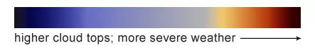
In this imagery, yellow and orange areas signify taller/colder clouds, which often correlate with more active weather systems. Blue areas are clear sky, while pale white areas indicate low-level clouds, or potentially frozen surfaces. Learn more about this weather imagery.
What does the GOES water vapor map layer show?
The GOES 'water vapor' map displays the concentration and location of clouds and water vapor in the atmosphere and shows data from both the GOES East and GOES West satellites. Imagery is updated approximately every 15 minutes in real time. Water vapor imagery, which is useful for determining locations of moisture and atmospheric circulations, is created using a wavelength of energy sensitive to the content of water vapor in the atmosphere. In this imagery, green-blue and white areas indicate the presence of high water vapor or moisture content, whereas dark orange and brown areas indicate little or no moisture present. This imagery is derived from band #10 on the GOES East and GOES West Advanced Baseline Imager.
What do the colors on the water vapor map represent?
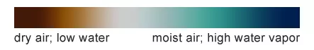
In this imagery, green-blue and white areas indicate the presence of high water vapor or moisture content, whereas dark orange and brown areas indicate less moisture present. Learn more about this water vapor imagery.
Why do I sometimes see missing data on the GOES West (GOES-17) infrared and water vapor maps?
During post-launch testing of the GOES-17 satellite's Advanced Baseline Imager (ABI), scientists discovered that the instrument's infrared detectors cannot be maintained at their required operating temperatures under certain seasonal and orbital conditions. This means there will be occasional degraded images and outages on the satellite’s infrared and channels.
NOAA engineers and scientists have made significant progress optimizing the performance of GOES-17 data. We are confident that the GOES constellation will continue to meet the operational needs of the National Weather Service and forecasters across the nation. Learn more about the GOES-17 cooling system issue here.
What is global true color imagery?
The global ‘true color’ map displays land, water and clouds as they would appear to our eye from space, captured each day by NOAA-20.
This ‘true color’ imagery is created using the VIIRS sensors onboard the NOAA-20 and Suomi NPP polar orbiting satellites. Although true-color images like this may appear to be photographs of Earth, they aren't. They are created by combining data from the three color bands on the VIIRS instrument sensitive to the red, green and blue (or RGB) wavelengths of light into one composite image. In addition, data from several other bands are often also included to cancel out or correct atmospheric interference that may blur parts of the image. Learn more about the VIIRS sensor here.
About the satellites
What are the GOES satellites?
NOAA’s most sophisticated Geostationary Operational Environmental Satellites (GOES), known as the GOES-R Series, provide advanced imagery and atmospheric measurements of Earth’s Western Hemisphere, real-time mapping of lightning activity, and improved monitoring of solar activity and space weather.
The first satellite in the series, GOES-R, now known as GOES-16, was launched in 2016 and is currently operational as NOAA’s GOES East satellite. In 2018, NOAA launched the second satellite in the series, GOES-S, which joined GOES-16 in orbit as GOES-17. GOES-17 became operational as GOES West in February 2019.
Together, GOES East and GOES West provide coverage of the Western Hemisphere and most of the Pacific Ocean, from the west coast of Africa all the way to New Zealand. Each satellite orbits the Earth from about 22,200 miles away.
What is the NOAA-20 satellite?
Launched in November 2017, NOAA-20 is NOAA's newest polar-orbiting satellite, and the first of the Joint Polar Satellite System (JPSS) series, a collaborative effort between NOAA and NASA. As the backbone of the global satellite observing system, NOAA-20 circles the Earth from pole to pole 14 times daily, providing full global coverage twice daily - from 512 miles away. The satellite's instruments measure temperature, water vapor, ozone, precipitation, fire and volcanic eruptions, and can distinguish snow and ice cover under clouds. This data enables more accurate weather forecasting for the United States and the world.